

Key Takeaways
- Brand guidelines have moved past a static PDF into living, searchable systems that connect directly to your asset library and workflows.
- Slack, Mailchimp, Spotify, Hulu, Uber, NASA, Target and Walmart, and Domino's each show a different real-world move worth copying, from Slack's paired-opposite tone rules to Walmart's exact clear-space and minimum-size specs for its Spark icon
- Modern guidelines now add dark mode palettes and AI content policies on top of the classic logo and color basics.
- The real work sits in governance, mapping each guideline section to DAM fields and approval paths.
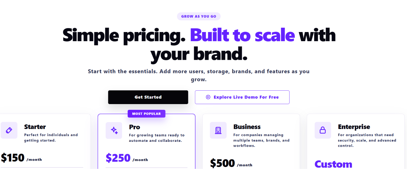
- BrandLife pairs interactive brand guidelines with multi-brand workspaces and AI search. Partner portals keep rules live instead of buried in files, and Starter runs $150/month.
A strong brand guideline gives your team a working model to copy, not just a set of rules to memorize, and this gallery gives you eight of them. Your brand team just fielded the third request this week for the "current" logo pack, and the file someone dug up turned out to be two campaigns old.
You already care about brand consistency. What you need are working models of strong guidelines and a setup that keeps those rules in use across internal teams and outside partners.
This guide gives you both. First comes a gallery of named brand guidelines examples with a copy-this takeaway for each. Then comes the shift from PDFs to portals, plus a realistic method for turning guidelines into governed, AI-assisted brand systems inside a Digital Asset Management (DAM).
What Modern Brand Guidelines Include in 2026
Modern brand guidelines need the classic foundational sections plus a newer set built for AI tools and dark interfaces, and a missing rule from either group shows up fast, usually as a logo request or a last-minute approval thread.
The foundational sections form the core every team references daily:
- Brand story, values, and the mission behind them, giving every downstream rule a reason to exist
- Logo management system, with primary and secondary marks, clear space, minimum sizes, background variants, and examples of misuse to avoid
- Color, with HEX, RGB, and Pantone values, plus pairing rules
- Typography, with a clear hierarchy and web or app guidance
- Imagery and iconography standards, defining style and composition
- Voice and tone, with usage examples and named personality traits
Two changes define what a 2026 guideline adds on top of that foundation. Screens now shift between light and dark, and more brand content passes through AI tools before it reaches a customer:
- Dark mode palettes, with paired values for light and dark interfaces
- Motion and micro-interaction standards, defining timing, easing, and the brand's on-screen feel
- Product and UX applications, keeping color and logos consistent inside live products, a point the Interaction Design Foundation's brand guidelines resource reinforces
- AI content rules, spelling out which content may be AI-assisted versus AI-generated, where human review is required, and how AI outputs should be tagged in metadata, a protocol highlighted in industry roundups like Connect Media Agency's
Each new rule needs a real home in your asset system.
Brand Guidelines Examples Gallery: 8 Systems Worth Copying
Each example below pairs the pattern worth borrowing with the DAM or workflow choice it suggests. The mix covers SaaS, streaming, retail, and franchise brands.
1. Slack, a voice and UI system for SaaS teams
Slack's public brand guidelines build the whole visual system around one deliberate color choice: Aubergine (#4A154B), a deep purple picked specifically to avoid the corporate blue every other enterprise tool was using at the time. The core palette pairs it with four accent colors, blue, green, yellow, and red, each with exact PMS, CMYK, RGB, and HEX values specified down to accessible-contrast pairings for text on each background. Typography runs on two typefaces, Larsseit for headlines and Slack Circular for body text, with explicit rules against setting headlines in all-caps or all-lowercase.
The voice guidance is just as specific. Slack's guide lists seven personality traits as paired opposites, confident but never cocky, witty but never silly, so a writer has a boundary on both sides of the trait rather than a vague adjective to interpret.
Ops takeaway: turn those tone rules into prompt patterns for AI copy tools, and map UI colors and type into a shared digital brand kit your designers and writers can pull from.
2. Mailchimp, channel-specific rules and illustration
Mailchimp publishes its entire content style guide openly, including the source files on GitHub, which is unusual for a company this size. The guide is built around five writing principles (empower, exhort, teach, celebrate, respect) and gets specific enough to ban italics, bold, underline, and caps in combination, and to require the serial comma throughout.
The brand's mascot, Freddie, illustrates the line between voice and visuals: the guide explicitly states Freddie can smile, wink, and high-five, but never talk, so brand voice stays owned by copy, not by the illustration.
Ops takeaway: split product content from marketing content in your DAM, and give each group matched templates so contributors can reach the right variant faster.
3. Spotify, motion and color for an audio-first identity
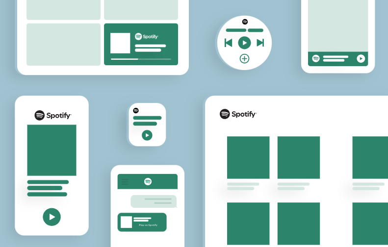
Spotify's official design and branding guidelines are unusually strict on logo integrity: no stretching, recoloring, rotating, or adding effects, full stop, with the green version restricted to black or white backgrounds only and a monochrome version required everywhere else. The 2015 identity system, developed with the agency Collins, introduced a "Lens" duotone treatment specifically to make third-party artist photography feel on-brand without visually clashing with Spotify's own palette.
Spotify's guidelines also cover logo lockups for partner campaigns directly, spelling out spacing and sizing so that neither Spotify's logo nor a partner's logo visually dominates the other.
Ops takeaway: translate motion and duotone treatment guidance into reusable video and image templates, and set clear naming conventions for AV assets so designers can find the right transition or treatment quickly.
4. Hulu, cross-device consistency
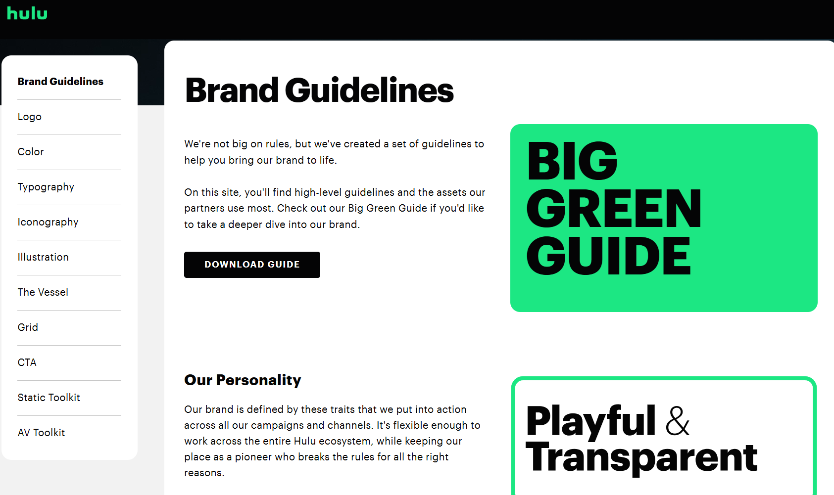
Hulu's public brand site is built around one non-negotiable: Hulu Green (#1CE783), which the brand's own materials describe as the single word people associate most with Hulu when asked. The 2021 rebrand, led by studio DixonBaxi, introduced the "Vessel," a rounded rectangular shape pulled directly from the curve of the lowercase "u" in the wordmark, which now anchors illustration, icon, and layout systems across the brand. Typography runs on a single family, Graphik, used consistently across marketing and product so the brand feels the same whether someone's looking at a billboard or the app itself.
Color usage is even quantified: Hulu's internal guide allocates roughly 60% of visual weight to its brighter "Show Time" palette and reserves a more muted "Business Time" green for internal decks and B2B use, so the same green means something different depending on context.
Ops takeaway: tag assets by device and context, then link brand rules to your streaming and product asset workflows so the right rendition and color world ship to each screen.
5. Uber, a systems-driven brand
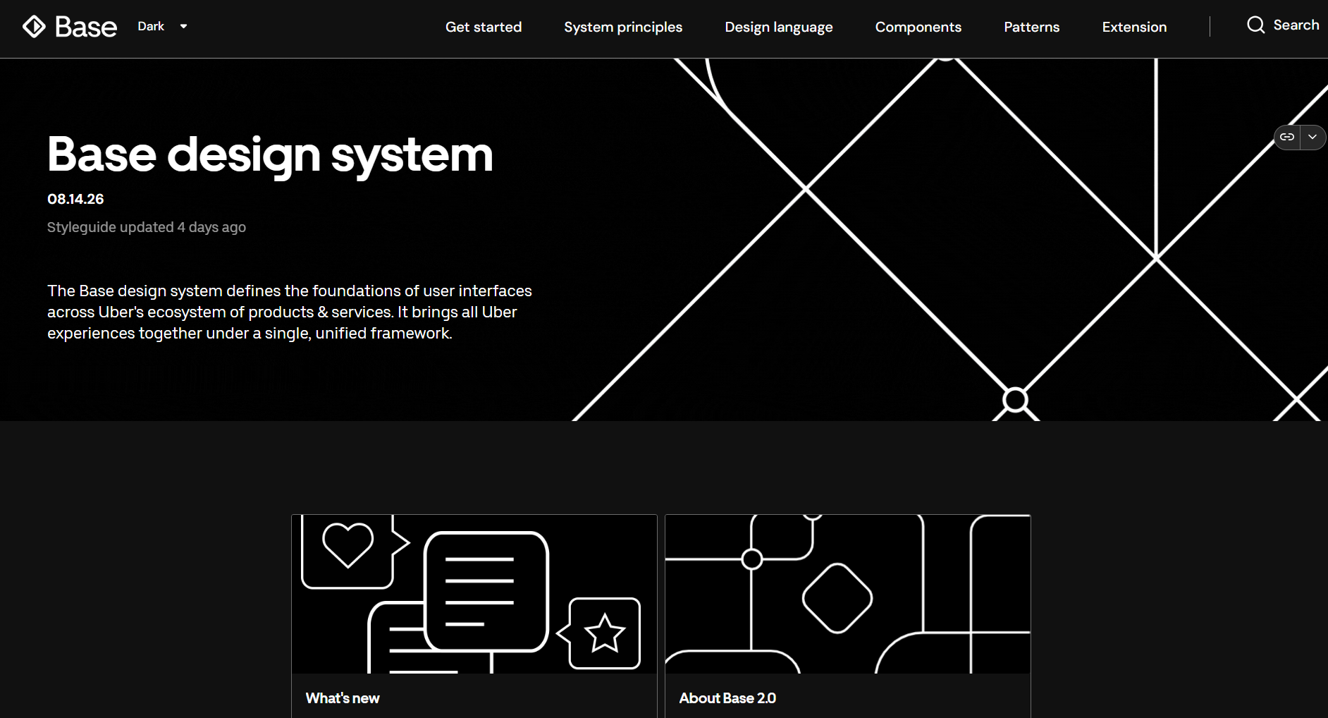
Uber's Base design system runs on a custom typeface, Uber Move, designed by type foundry MCKL with Wolff Olins for the 2018 rebrand, and it ships in three cuts, Display, Text, and Mono, with the monospaced Mono variant reserved specifically for prices and other numbers where consistent character width matters. The palette is deliberately tight: black and white for nearly everything, with a single accent blue (#276EF1) carrying every moment that needs to signal trust or action.
Uber's partner-facing brand guide requires every external use of the Uber name or logo to be pre-approved before publication, a stricter gate than most of the other brands in this list.
Ops takeaway: mirror design tokens like Uber's single-accent-color rule in your own DAM metadata, and link that library to a design system so product and marketing teams work from the same source.
6. NASA Graphics Standards Manual, the print-era benchmark
NASA's 1975 manual, designed by Richard Danne and Bruce Blackburn and formally published as NHB 1430.2 in January 1976, is still referenced by designers today for how completely it standardized a sprawling organization.
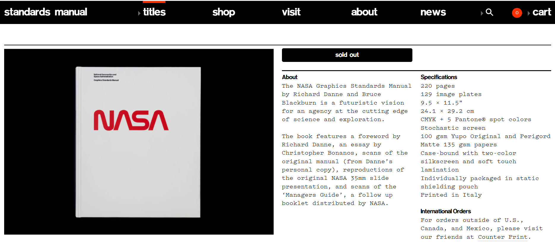
The manual's signature element, the "worm" logotype, deliberately removed the crossbars from both letter A's in NASA, a controversial choice at the time that Danne described as suggesting technology, propulsion, and lift. The guide specified exact placement rules down to how the logo appeared on the Space Shuttle's thermal tiles.
NASA rescinded the worm identity in 1992 in favor of the older "meatball" insignia, though it has resurfaced on select missions since, including a 2020 SpaceX launch.
Ops takeaway: use it as a contrast point. A print manual freezes rules at publication, while a live digital guideline updates in place, so every partner sees the current version instead of a decades-old standard nobody revisited.
7. Target and Walmart, retail color and e-commerce discipline
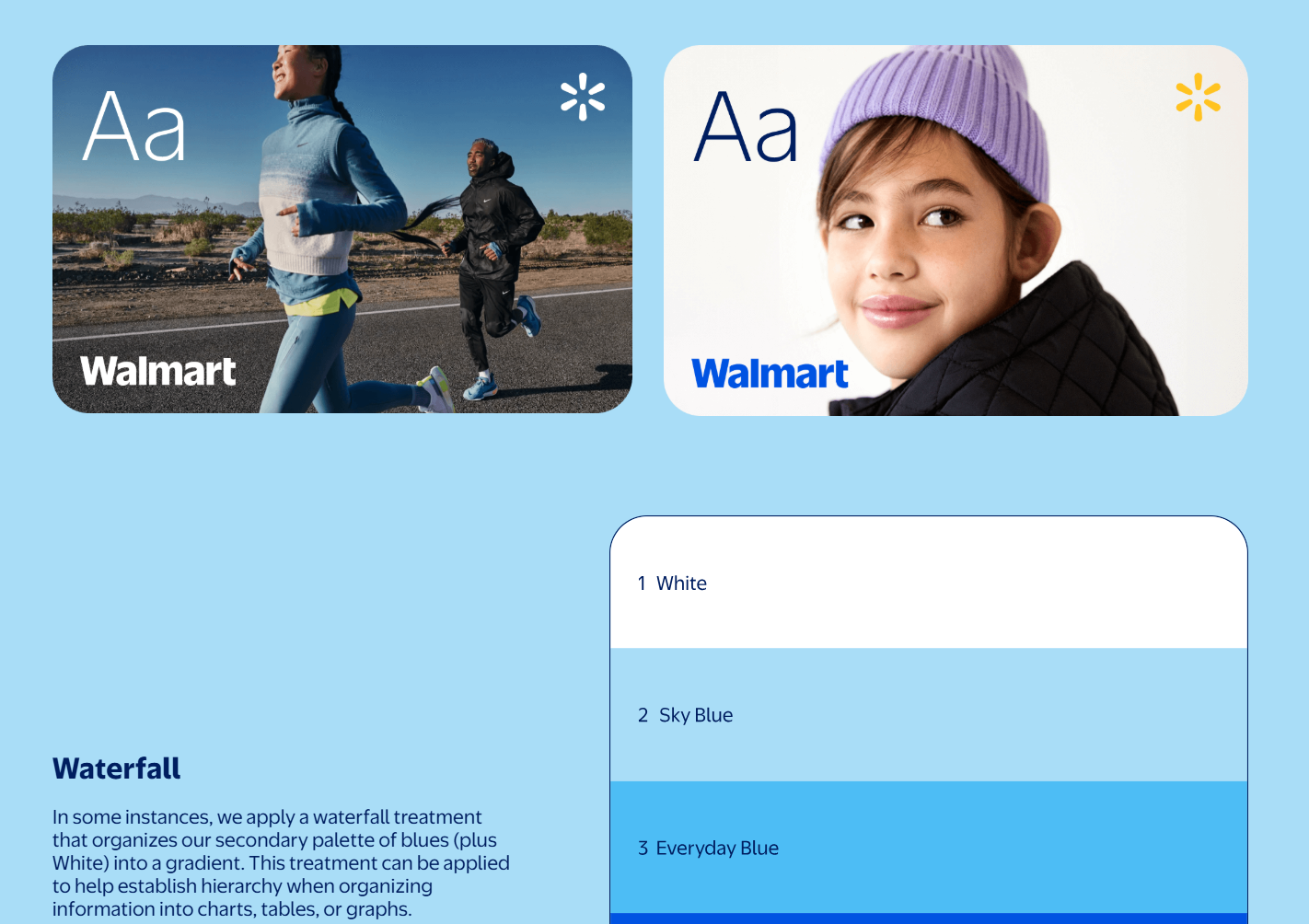
Walmart's public Brand Center documents its palette down to the pairing level: True Blue and Spark Yellow as primary colors, with three supporting blues (Bentonville Blue, Everyday Blue, Sky Blue) reserved for specific hierarchy roles like typography versus charts and infographics. The Spark icon itself has a defined clear-space unit, a "Sparklet," plus explicit minimum sizes (0.25 inch print, 16px digital) and a rule that it can only be recolored with written approval from Walmart Creative Studio.
Target's guidelines run in the opposite direction stylistically, built around a single graphic device, the red bullseye, that the brand's own case studies note is one of the only major retail marks that works without any accompanying wordmark at all.
Ops takeaway: align packaging guidelines with e-commerce image specs, defining required angles and file formats per marketplace, with your DAM as the single source of truth for each SKU.
8. Domino's, franchise standards with local activation
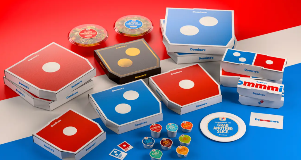
Domino's operates a 99%-franchised model across more than 21,000 locations globally, which makes brand consistency an operational problem as much as a design one. The company's 2025 brand refresh introduced Domino's Sans, a bolder custom typeface, alongside intentionally louder red and blue colors used deliberately, sometimes to highlight a single word in a sentence, sometimes as large color floods behind a product shot, as part of the brand's "Hungry for MORE" strategy. A rigorous franchise audit system enforces these standards across every outlet.
Ops takeaway: distribute pre-approved, editable templates through partner portals, so franchisees can self-serve on-brand flyers and social posts instead of sending every request back to HQ, the same problem Domino's own audit system exists to catch after the fact.
Online Portals vs. Static PDFs
A hosted brand portal fixes the two biggest costs of a static PDF: version confusion and repeat asset requests. A guideline PDF sent on Monday can feel old by Friday, and every stale copy creates room for off-brand work.
Static PDFs break down in a few predictable ways:
- Outdated files keep circulating after a refresh, and people rebuild assets when approved versions are hard to find
- A minor color change forces a new send to every team and partner, which is where version confusion starts
- A PDF leaves out permissions and download tracking, which keeps your brand team answering the same asset requests, the kind of load BrandLife customers report cutting by 70%
An online brand portal adds back what the PDF was missing:
- Role-based access decides who sees which assets, and each guideline section can link straight to the matching asset filter
- Updates go live in place, so the version a franchisee opens today is the version your brand lead approved this morning
- Guidelines and DAM search sit in one place, a pattern common enough that collections like the "15 online brand guidelines" roundups exist just to catalog examples of it
Use the portal as the front door to your asset library, and many routine requests answer themselves.
From Guidelines to Governance: Mapping Sections to Your DAM
Turning a beautiful guide into a governed one means mapping each classic guideline section to specific DAM fields and permissions, not just publishing the rules and hoping people follow them. Your team feels the difference the moment someone needs the right file fast.
A "Logos and lockups" collection stores each derivative and flags the latest approved mark, and can also carry region restrictions for files tied to specific markets. Color and typography follow the same pattern: store design tokens and Figma libraries behind edit permissions so the palette stays locked. Imagery needs controlled vocabularies for subject and usage rights. Voice belongs beside templates, with writing playbooks linked where writers work. Motion files benefit from device tags so the right rendition reaches each screen.
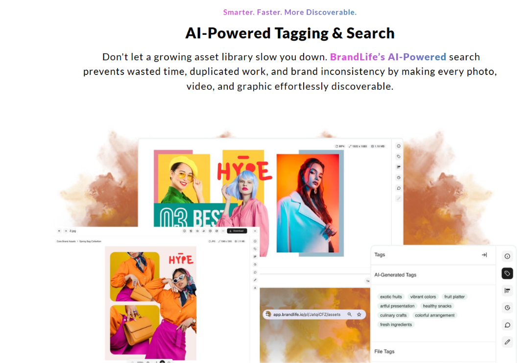
AI content rules need the same DAM-level enforcement as everything else in the table above, not a policy that lives only in a document. Auto-tag each AI output on ingest so you can trace it and pull it if questions surface, and use AI-assisted tagging to align new uploads with your taxonomy, which keeps findability high as volume grows. Load guideline-compliant prompt templates into the creation flow so contributors start on-brand.
A simple maturity ladder captures the whole shift: static PDF, then online reference, then integrated portal, then governed AI-assisted system.
How BrandLife Keeps Brand Guidelines Living and Governed
BrandLife closes the challenge between a written guideline and a governed one by wiring brand colors and messaging rules directly into the same workspace as the assets they govern. Interactive guidelines let partners verify compliance in one place, since the rule and the file appear side by side, and version control plus asset expiration stop retired campaign creative from circulating. Approval workflows and custom metadata replace email-chain sign-offs with a clear routed status, so guidelines update in place and stale PDFs stop spreading.
That structure scales the same way an agency or franchise network needs it to. Multi-brand workspaces keep dozens of brands separated cleanly, each with its own colors, fonts, and asset library, while AI-powered search tags assets by product, SKU, category, and campaign.
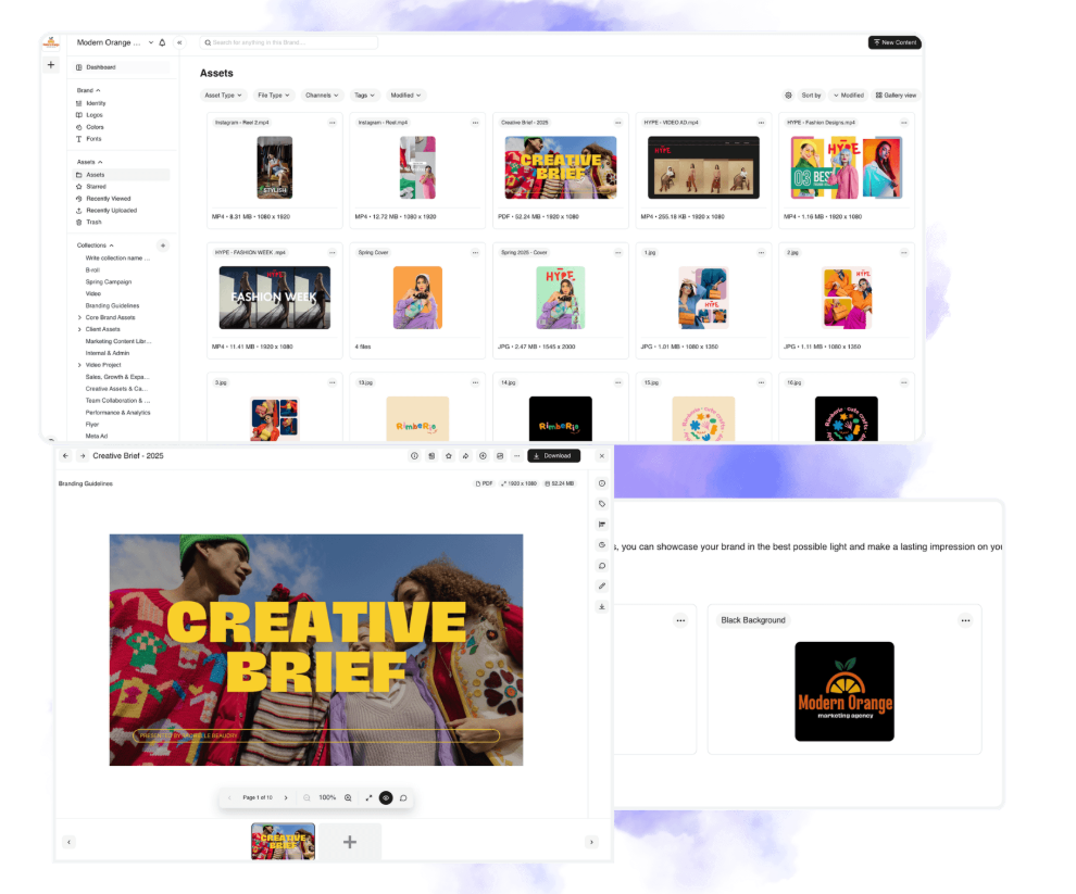
Unlimited free partner brand portals show franchisees and resellers only the assets and guidelines they're approved to use, with secure sharing and expiration controls, a fit for both franchise programs and e-commerce variant work.
The gallery above walked through eight named brand guidelines examples and the move worth copying behind each, from Slack's voice rules turned into prompts to Domino's franchise activation inside clear guardrails. Strong guidelines pay off when they live inside a governed system like the one described above, mapping each section to DAM fields and permissions, then adding AI rules instead of leaving the guidance stranded in a PDF.
BrandLife customers report 70% fewer asset-request emails and 6+ hours saved weekly per creative. Pricing stays transparent, with Starter at $150/month and Enterprise on custom pricing.
Audit your current guidelines against the gallery above, then build a version your teams and partners will actually use. If you want one workspace for assets, approvals, and live rules, Get Started with BrandLife.
Frequently Asked Questions
How often should we update our brand guidelines?
Tie reviews to a set cadence, plus every major launch or rebrand. A quarterly check catches drift before it spreads across channels. Live portals change the cadence because small edits can go live as soon as your brand lead approves them, and partners keep pulling the current rule from one link.
Who should own brand guidelines internally?
Shared ownership usually works best. Brand sets the rules, marketing ops runs the workflows, and creative ops keeps the asset library clean. Name one DAM owner to hold permissions and approval routing, which stops the "who approved this" scramble when a partner needs a fast answer.
What file formats should we store along with our guidelines?
Keep source files and export files for each logo, so designers can grab vectors and teammates can grab ready-to-use PNGs. Store design tokens and Figma libraries for color and type, and add Lottie files for motion. Tag device-specific renditions for e-commerce product shots and streaming screens so the right size is ready when a channel needs it.
How do we measure whether our guidelines are being followed?
Portal analytics give you a clear signal. Track downloads and active users, and watch which assets partners use. Approval logs show where sign-offs stall. Pair that data with off-brand escalation counts, which show how often someone flags a wrong logo or stale asset. A steady drop in escalations usually points to stronger adoption.
Can small teams build modern brand guidelines without a big budget?
Yes. A small team can start with one workspace and one live guideline, then expand as the brand grows. Transparent plans and add-ons make that path easier to budget than a large legacy DAM commitment. The Starter plan runs $150/month for one user, one brand, and 1GB of storage, with core DAM features, AI tagging, and brand guidelines. As you add brands, storage, or users, you can expand step by step.