

Key Takeaways
- A brand style guide sets the rules for how your brand looks and sounds across every channel and partner.
- Static PDFs and shared drives leave teams guessing and slow every approval cycle.
- Core elements cover the logo system and color, typography and imagery, plus voice and governance.
- Build it in seven steps, including, audit, define identity, codify systems, operationalize, centralize, govern, and measure.
- BrandLife keeps guidelines living inside your DAM, tied to approved assets and partner portals, with AI search built in.
A brand style guide is the centralized reference for how your brand looks and sounds, so a team member checking the rules gets one clear answer instead of three plausible ones. Your creative lead opens two drives to pull the logo for a franchise launch, and three versions show up, each one looking plausible enough to use, while the launch clock keeps ticking and someone has to guess.
That moment plays out across brand and creative teams every week. You manage more channels and partners than a single PDF can govern, and the rules exist somewhere, just unreachable at 6pm when someone actually needs them.
This guide covers what a brand style guide includes, why older formats break down, the core elements that belong inside, and a step-by-step build. We'll weigh the trade-offs too, and show how a modern Digital Asset Management (DAM) keeps the guide usable day to day.
What Does a Brand Style Guide Govern
A brand style guide sets the rules, while your DAM stores the approved files, templates, and permissions those rules apply to, and file chaos starts the moment those two things live apart. New hires and outside agencies need one place to check the rules before they publish anything, and category references describe the guide as a playbook for internal teams and outside partners, with the goal being consistency as content volume grows.
Teams move faster when the rule sits beside the approved file. Put the logo clearspace rule next to the approved logo file, and people follow it more easily. Split the rule into a PDF while the file sits in a drive, and drift starts almost immediately.
- A flat document struggles to keep pace once your brand shows up in print, product UI, and partner channels at the same time
- Interactive guides update in place, so everyone sees the current rule at the same time
- Connecting the rule and the file inside one governed system closes the gap between knowing a standard and applying it
Why Static PDFs and Shared Drives Slow Your Team Down
A stale PDF rarely breaks your brand in one dramatic moment, and instead slows the team in small, expensive ways that stack up across reviews, requests, and partner handoffs.
1. Version confusion and stale files
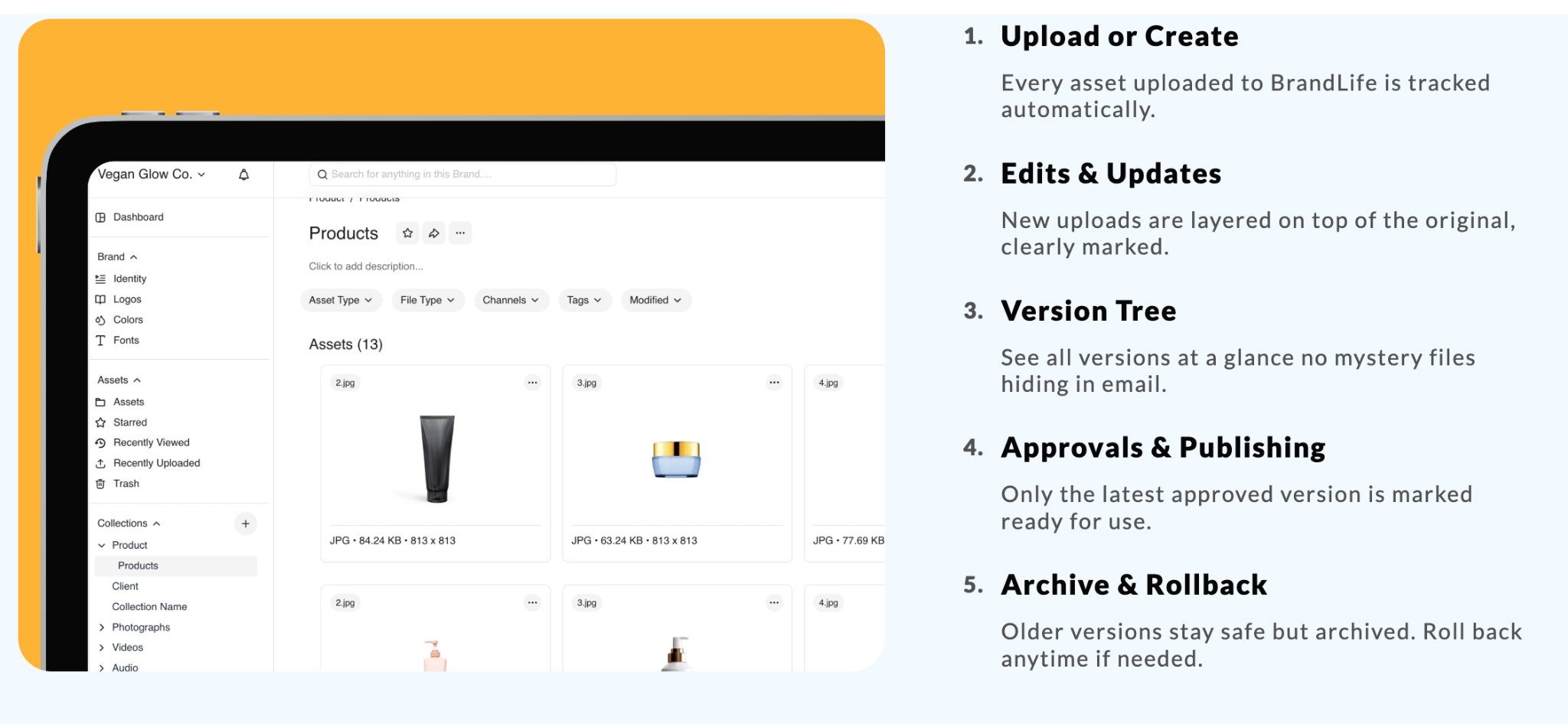
Old logos rarely stay retired on their own, and a designer grabs last year's hero image and reworks a whole layout around it before anyone notices. Each wrong file adds rework and chips away at brand equity, and a shared drive holds everything, including the mistakes. Version control and asset expiration help fix that at the source.
2. Repeated "is this on-brand?" reviews
Each unclear rule creates another Slack message and another review round, as someone pings the brand manager, waits for an answer, then revises and re-sends. Clear rules with right-and-wrong examples cut the back-and-forth, and BrandLife customers report 70% fewer asset-request emails once approved assets and rules sit in one place.
3. Partner and regional drift
Regional teams improvise when approved files take too long to find, and a local team recreates a promo with off-palette colors because the correct template sat two folders deep. Governance helps close that door. When partners access a portal that shows only approved assets and simplified rules, local execution stays more consistent.
How to Create a Brand Style Guide Step by Step
Building a brand style guide takes seven stages, moving from audit to measurement, so scattered logos and vague rules stop turning every launch into a manual cleanup job.
Step 1: Audit current assets and guidelines
Cleanup starts with evidence, not opinion, so inventory your logos, colors, typography, and messaging across every channel and market. Flag the inconsistencies you find, like multiple logo versions or competing color values, and map where the rules live today, including PDFs and shared drives.
Step 2: Define identity and brand architecture
Brand architecture choices ripple through every template and approval path, so nail down your mission, positioning, and personality in plain language. Multi-brand teams should document how the parent brand and sub-brands relate, since that hierarchy decides which rules cascade and which stay local.
Step 3: Codify visual and verbal systems
Rules become usable when people can see them in action, so set logo usage, palettes, and type hierarchy with real examples. Give imagery direction and voice the same specificity, pairing every rule with a right-and-wrong sample.
Step 4: Operationalize for channels and workflows
Channel details decide whether the guide helps or just sounds good on paper, so cover digital and physical placements with specifics for each. Then build reusable templates for social posts, presentation decks, and email. A designer who starts from an approved deck template stays closer to the standard from the first draft.
Step 5: Digitize and centralize
Searchable guidelines beat file-hunting every time a partner needs an asset, so move to interactive guidelines that are searchable, versioned, and tied to approved files and permissions. That connection closes the distance between knowing a rule and applying it, since people act on rules they can reach in one click.
Step 6: Govern and train
Adoption rises when training is short and the exception path is clear, so onboard internal teams and outside partners with a simple walkthrough. Set an update cadence of every 6 to 12 months so rules stay current, and add a request form for exceptions and questions.
Step 7: Measure and iterate
The first month after launch tells you where the guide is strong and where it needs sharper examples, so track brand compliance in campaigns, creative cycle times, and asset reuse. BrandLife customers report 50% faster launch cycles and 6+ hours saved weekly per creative once guidelines and assets sit together. Use those signals to refine the guide over time.
Core Elements of a Modern Brand Style Guide
A modern brand style guide needs six core elements, moving from brand story through governance, so agency partners and internal teams have the same reference from day one.
1. Brand story and positioning
Agency partners need context before they can apply a palette or headline style, and your mission and brand promise shape the visual and verbal choices that follow. Write this section for a new partner reading it cold, naming the brand personality plainly and stating the promise in a few clear lines.
2. Logo system and usage
Logo misuse is one of the fastest ways to make polished work look off-brand, so your guide needs every approved logo variant, including horizontal, vertical, and icon-only versions:
- Clear space and minimum sizes, so nothing gets cramped
- Background rules for light and dark placements
- Clear "do not" examples, like stretched or recolored marks
An annotated clearspace diagram shows partners the exact breathing room a logo needs.
3. Color system
One stray hex code can make a campaign feel like it came from someone else, so document primary and secondary palettes with full specs:
- HEX and RGB for screens
- CMYK and Pantone for print
- A usage hierarchy so people know which color leads and which supports
Confirm contrast choices against recognized accessibility standards before you publish.
4. Typography
Type choices shape readability on every landing page and deck, so list font families with a clear hierarchy for headings and body copy, keeping web fonts separate from print fonts so licensing and rendering stay clean. Include fallback fonts for email and partner tools that lack your licensed faces, and set minimum sizes and line spacing for readability across screens.
5. Imagery, iconography, and voice
Stock imagery and vague copy rules create drift fast, so define your photography style and your illustration style, giving icon rules the same treatment so product and web stay coherent. Then codify brand voice and tone with sample phrases showing right-and-wrong versions, plus a short terminology list. Examples make the rules easier to apply than adjectives alone.
6. Governance and multi-brand rules
Approvals stall when nobody knows who can grant an exception, so document the owner of the brand, the escalation path, and the approval workflow, naming who signs off on exceptions. Multi-brand teams add another layer here, clarifying master-brand rules and sub-brand freedoms, with franchise and reseller networks needing the sharpest lines. E-commerce teams can extend this section to product detail page specs, image ratios, background rules, and alt text tone.
A locked-versus-flexible split shows partners what to protect and where they can adapt.
What to Weigh Before You Build
Tool choice affects daily adoption as much as the guide itself, since search, permissions, and long-term cost usually decide whether teams keep using the system.
1. Guideline usability and searchability
A guide slows the team the moment a new hire needs help finding the logo clearspace rule, so web-based and versioned modules beat a flat file for daily work. Multilingual support helps once your teams span regions. Ask a simple question during evaluation: can someone find a rule on their own in seconds? If the answer is shaky, usability needs work.
2. DAM integration and permissions
People follow rules more often when the approved file sits beside them, so link each guideline to specific assets and tie usage restrictions to those rules. An "internal only" or "campaign-limited" flag can then travel with the asset, keeping the guide practical because the rule and the file share one home.
3. Hidden costs to plan for
Migration costs usually show up after the software decision, not before it, so budget for moving guidelines, re-tagging assets, and training your teams, including partners in that plan too. Storage matters if you manage high-resolution video or large product libraries, and seat growth matters too, especially when partner and franchise access expands into new markets.
4. Scaling and governance
A small library can survive loose controls, while a large one needs stronger governance, so role-based access keeps the right people in the right rules. SSO and audit logs add the controls security-conscious teams often need as users and assets multiply.
How BrandLife Keeps Your Style Guide Living
A brand style guide stays useful when your team can find it at the moment of use, and BrandLife ties guidelines to assets, search, and partner distribution inside one workspace. BrandLife's interactive brand guidelines show colors, fonts, logos, and messaging rules inside the same workspace as your assets, so update a palette once and everyone sees the change in place instead of working from an old PDF in a drive.
BrandLife's YouTube channel covers this exact shift from static guidelines to a living system, hosted by CMO Shannah.
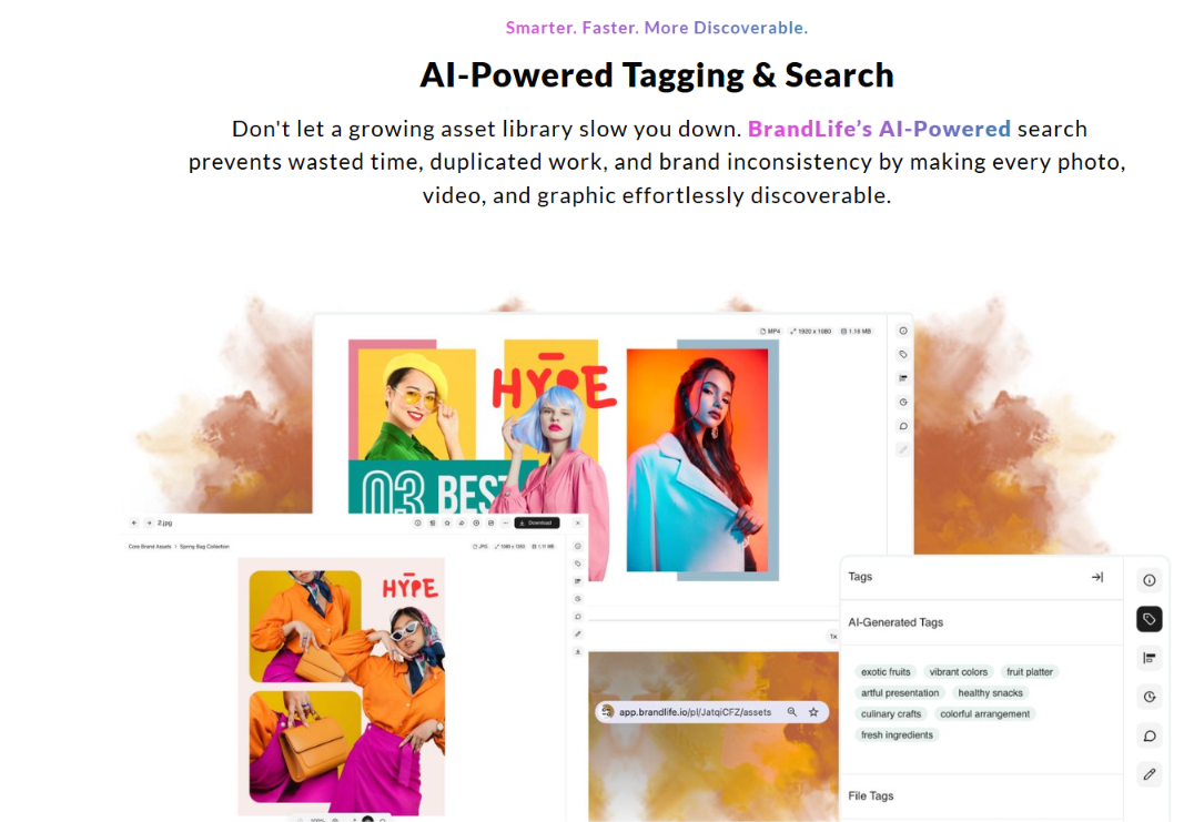
BrandLife's AI-powered search tags are assets by color, product, SKU, category, and campaign, and customers report 40% less time searching once tagging sit inside one workspace.
Multi-brand workspaces give each brand its own palette, font library, and storage, while branded partner portals show franchisees and agencies only the approved assets they need, with expiring links keeping retired creative out of circulation.
That combination fits retail chains centralizing regional signage, franchise networks keeping local promotions on-brand, and e-commerce teams syndicating consistent product pages across retailers.
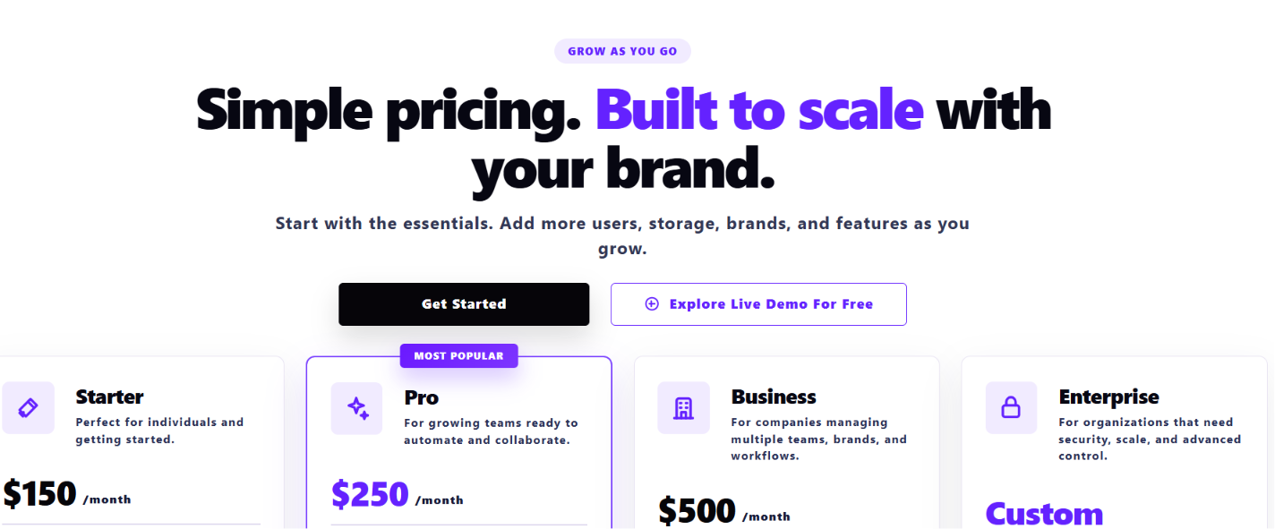
Starter begins at $150 per month for 1 user, 1 brand, and 1GB of storage, with custom Enterprise pricing for larger teams.
If your team is ready to replace file chaos with one source of truth, get Started with BrandLife.
Frequently Asked Questions
How long should a brand style guide be?
Complexity should set the length, so a single-brand startup may need a short guide while a multi-brand enterprise with franchise and e-commerce rules will need more. Aim for completeness over page count, and keep only the rules people will use.
What is the difference between a brand style guide and a brand book?
A brand book usually leans more narrative, covering the brand story and the strategy behind it, while a style guide is the operational rulebook for logo usage, color specs, and voice rules. Many teams keep both, with the book inspiring and the guide governing.
Who should own the brand style guide?
One clear owner keeps decisions moving, and that person is often the Head of Brand or a brand operations manager. Creative and marketing teams can feed input, while the owner holds final sign-off, and an escalation path gives exceptions a documented decision.
How often should you update a brand style guide?
A review every 6 to 12 months is a common baseline, with updates sooner when your identity, product line, or channel mix changes. A living guide inside a DAM makes this simpler, since edits publish in place for every viewer.
Can partners and franchisees access the guide without full editing rights?
Yes. Role-based portals can show partners only the approved assets and simplified rules they need, letting them download ready-to-use templates and follow the locked-versus-flexible rules while editing rights stay with your internal brand team. Expiring links help keep outdated creative from spreading.