

Key Takeaways
Visual identity is the visible system of design elements plus the rules that govern their use across every touchpoint. Logo and color palette both sit inside that system.
A strong visual identity works as a system that reaches well past a single logo. It needs documentation and governance to stay consistent at scale.
Core components start with a logo system and a color palette. Typography and layout act as the connecting rules.
Building one follows a clear order. Brand strategy comes first. The visual system and living guidelines follow.
Static PDF brand books break down in practice. A modern Digital Asset Management (DAM) turns identity elements into governed, searchable assets so partners and internal teams stay on-brand.
Visual identity is the set of design elements that makes a brand recognizable on sight, but it only earns that recognition when every touchpoint pulls from the same approved source. Your creative lead just spent an afternoon rebuilding a logo lockup that already exists. The approved file sat three folders deep in someone's Drive. Brand and creative teams lose time to this every week. The identity may be solid; access and control are usually the real problem.
Developers run into the same drift from a different angle. In a DEV Community post, one developer, writing for other developers, argued that most people don't abandon a landing page because of the logo, they leave because the visuals feel inconsistent: social ads run one font, the pitch deck runs another, and website buttons look like they belong to a different product. Even when each individual asset looks fine on its own, that inconsistency chips away at trust, making the brand feel like it doesn't have its act together.
More channels, more partners, and more regional teams put extra pressure on brand consistency. Visual identity sits near the front of brand governance, and when it slips, people notice quickly. A wrong shade of blue on a retailer listing signals drift. An outdated logo on a franchise flyer does the same.
This guide covers what visual identity is and its core components. It also shows how it differs from brand identity and brand guidelines. It walks through building a system and shows real scenarios.
What is Visual Identity?
Visual identity is the set of design elements that makes a brand recognizable on sight, typically the logo, color palette, typography, and imagery, held together by iconography, layout rules, and usage standards. People form an impression before they read your headline, which is why this system matters more than any single asset inside it.
Many brand guides describe visual identity as a coordinated system, not a loose folder of files. Frontify's own guide to visual identity presents it as a repeatable framework with defined rules, where each element carries meaning and each rule protects consistency across channels.
Six months is plenty of time for a PDF brand book to drift from daily reality. The document may stay polished, while the files move, change, or get duplicated elsewhere, and teams start guessing while partners improvise, so consistency fades. Modern teams keep identity inside the tools and libraries they use every day instead, with guidelines, palette tokens, type styles, and approved assets sitting in one governed workspace. Update the source, and teams work from the current version. That shift, from static document to living system, runs through the rest of this guide.
Why Visual Identity is Important for Brand and Marketing Teams
Visual identity matters because it does two jobs at once. First, it builds recognition through repeated exposure, and second, it builds trust when every touchpoint looks intentional rather than improvised.
First impressions happen fast, and repeated exposure builds recognition. Consistent color, typography, and imagery help people identify your brand across campaigns and channels. That consistency also builds trust. When touchpoints look intentional, your brand feels more reliable.
File chaos shows up in expensive places:
-
Version confusion sends the wrong logo to print
-
Designers rebuild files that already exist
-
Sales and partner teams email creative for assets they should be able to find on their own
Each delay costs time and weakens consistency. Centralized governance changes that daily math. BrandLife customers report 40% less time spent searching for assets and 70% fewer asset-request emails once brand elements live in one governed workspace, which teams feel as faster launches and fewer off-brand escalations.
Accessibility belongs inside the identity system from day one. Color choices need enough contrast to stay readable. The WCAG contrast guidance from the W3C gives teams a strong baseline. Building contrast rules into the palette early saves rework across web, email, and product content.
Core Components of a Visual Identity System
A complete visual identity system has six components: a logo system, a color palette, typography, imagery, iconography, and the layout, motion, and voice rules that connect them.
Logo system
One logo file rarely covers every real channel. A usable logo system often includes a primary mark and a secondary stacked version. Many teams also keep a symbol-only mark, a wordmark, and a favicon or compact mark. Light, dark, and monochrome versions matter too. Clear rules matter just as much as the files. Define clear space and minimum size. Show the incorrect uses that stretch, crop, or recolor the mark.
Color palette
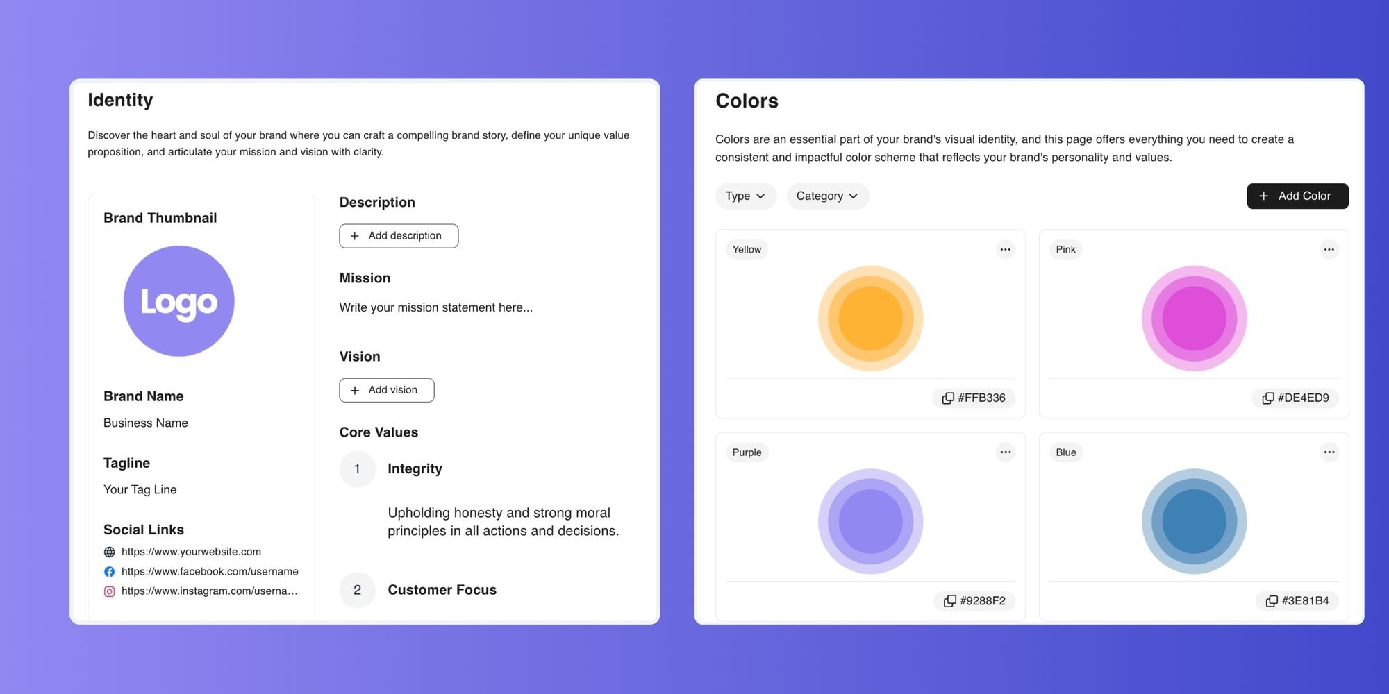
Most brand systems stay manageable with four to six colors. Many teams use a 60/30/10 balance for primary, secondary, and accent usage. Document each color in HEX and RGB for screens. Add CMYK and Pantone for print. Include contrast guidance so the palette supports accessible design from the start.

Typography
Too many typefaces make a system harder to apply. Many guides recommend one to three typefaces with defined roles, such as display, body, or UI. Lock in the type scale, weights, and line heights. A clear hierarchy shows how headlines, subheads, and body text should work across web, social, and sales materials.
Imagery and photography
Two brands can photograph the same product and land in completely different places. Style, treatment, and subject choices are what make imagery feel consistent. Give teams approved examples, plus anti-examples that miss the mark. Rights and licensing guidance belong here too, especially when stock and partner photography enter the mix.
Iconography and graphic elements
Icons drift quickly when each team picks its own set. A unified library should share stroke weight, corner radius, and overall style. Graphic devices like shapes or patterns can extend the system into layouts and backgrounds. Those elements should support the brand, not compete with it.
Layout, motion, and voice
Spacing rules are what turn separate assets into a recognizable page. Grid systems and layout principles create consistency across web, email, decks, and social. Motion guidance helps digital products and campaigns feel related. Voice and tone act as the verbal counterpart to the visuals. Inside a modern DAM, teams can manage many of these pieces as reusable brand components alongside approved assets and templates.
Visual Identity vs Brand Identity vs Brand Guidelines
Brand identity is the whole system, visual identity is the part people recognize on sight, and brand guidelines are what keeps both consistent, a distinction that kickoff meetings tend to blur.
Brand identity is the broader set of visual and symbolic elements a brand uses, including its name and verbal expression. Visual identity is the visible subset, such as logo, colors, type, imagery, and layout. Brand guidelines are the rules and documentation that explain how to use those elements. Resources like Canva's own brand identity guidance draw a similar distinction between the broader identity and its visual parts.
A PDF can list your rules, but access and workflow drive actual compliance. Enforcement gets easier when guidelines connect to the same DAM your team uses for approved files, since the rules become live documentation tied to current assets. People spend less time guessing when interactive brand guidelines sit beside the files people download, so the right choice is easier to make.
How to Build a Visual Identity System That Scales
Step 1: Set the brand strategy foundation
Six months of redesign work can vanish when strategy is never clear. Mission, values, and positioning should come first because the visual system exists to express them. Color and typography choices should connect back to that foundation. Clear strategy gives later decisions a reason to hold up under review.
Step 2: Design the visual system in sequence
Order helps teams make more coherent choices. Some guidance suggests building color first, then typography, then logo, followed by imagery and iconography. That sequence gives the system a strong base before the final mark takes shape. It can also improve consistency when multiple people contribute to the work.
Step 3: Document living guidelines
Teams move faster when rules are easy to find. Strong guidelines cover logo rules and a full type hierarchy. They also include color specs for screen and print, with contrast guidance where needed. Add imagery examples, anti-examples, and an icon library. Voice and tone guidance belongs here too. Templates for social posts, decks, or retail content turn those rules into practical defaults.
Step 4: Centralize, govern, and measure
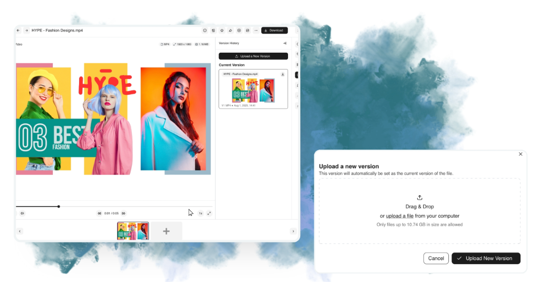
Approved assets lose value when they scatter across drives and inboxes. Move core brand elements into one source of truth with permissions and version control. Track adoption so you can spot where drift starts. Teams running multiple brands can use multi-brand workspaces to keep each identity separate and governed on its own terms. Plan for periodic updates as strategy, channels, and market needs change.
Examples and Scenarios of Visual Identity
A multi-brand consumer company can hit the same wall many growing teams face. Regional marketers rebuild logo lockups and social templates because sub-brands live in separate folders. Duplicate assets pile up. Old files keep circulating. When each sub-brand moves into its own governed workspace, with a distinct palette and font library, rebuilding slows down. Approved templates give regional teams a safe starting point. Content moves faster, and brand violations drop.
Franchise networks run into a similar problem at a different scale. Local teams need to tailor promotions while staying on-brand. A branded portal gives each partner access to the right assets and templates for that region. They can localize copy while the identity stays controlled. These scenarios are illustrative, drawn from common patterns in brand and creative operations. The operational lesson is simple. A governed identity works better than a scattered one.
How BrandLife Approaches Visual Identity
Static PDFs get stale as soon as logos, colors, or templates change. BrandLife closes that gap by treating identity elements as governed, reusable components inside the asset workspace, with brand colors, fonts, logos, and messaging guidance living beside the approved files people actually use.
The day-to-day value comes from one connected system:
-
Interactive brand guidelines sit beside the asset library, so teams can verify rules without jumping between tools
-
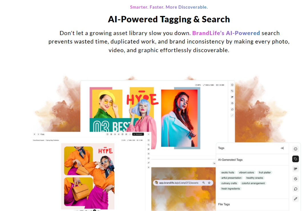
AI-powered search and tagging helps people find approved files faster instead of rebuilding them
-
Multi-brand workspaces give each brand its own palette, font library, and storage
-
Brand portals for partners and franchisees show external teams only the assets they're approved to use
The BrandLife demo video shows this in action, including how version control keeps a library clean and how AI tags images, videos, and documents automatically on upload.
Visual identity is a governed system of visual elements and rules, well beyond a single logo, and it earns its value when your team can find and use it correctly. Run the checklist against your current setup: is your identity documented in full, does it live in one place with permissions and version control, and can your tools support those rules across creative and e-commerce work? If your brand elements still live as loose files on a drive, that gap costs time and consistency every week. Get Started with BrandLife.
Frequently Asked Questions
What is the difference between visual identity and brand identity?
Visual identity is the subset people register on sight, like the logo and color palette. Typography and imagery round it out. Brand identity is the fuller set, including verbal and symbolic elements like your name and voice. Think of brand identity as the whole and visual identity as the part your audience sees first. Both benefit from clear documentation and a governed workspace instead of scattered files.
What are the core elements of a visual identity?
Most systems start with a logo and a color palette. Typography and imagery built on that base. Iconography and graphic devices extend the system. Layout and motion rules shape how everything comes together across pages and screens. Voice and tone act as the verbal counterpart. Usage rules keep the whole system consistent across channels.
How often should a business refresh its visual identity?
Strategy shifts are a better trigger than a calendar date. Repositioning, mergers, major product changes, or visible inconsistency are common reasons to update the system. Teams should also watch for brand drift. When people keep improvising because the rules feel dated or unclear, the identity needs attention.
How can small or emerging brands build a strong visual identity on a limited budget?
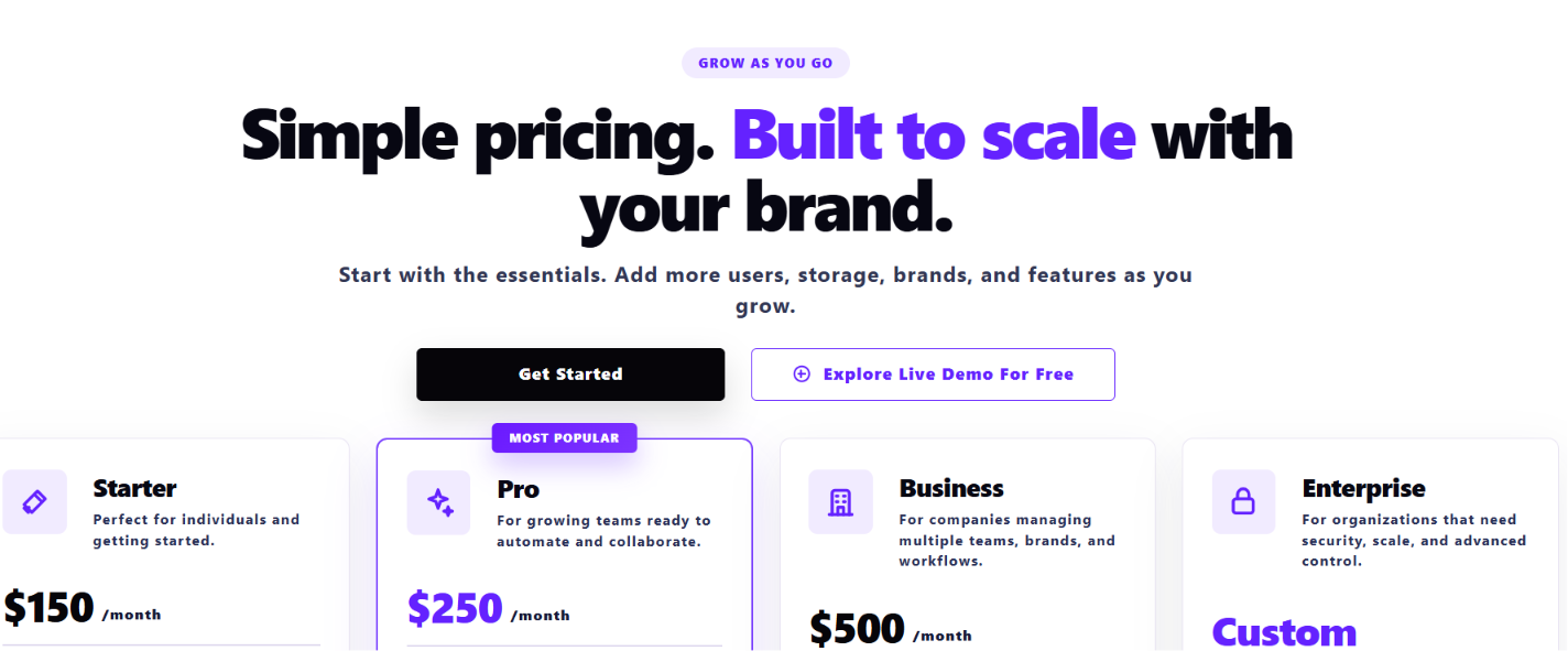
Small teams get the best return by starting with strategy. A clear foundation prevents expensive rework later. Keep the system focused with a small color palette and one to three typefaces. Document living guidelines so people use the same rules. Then centralize those assets in a DAM your team can afford. BrandLife's Starter plan at $150/month gives growing brands brand guidelines and asset storage without an enterprise contract.
Why do PDF brand guidelines fall short at scale?
Version drift starts quickly when guidelines live in a static file. Every update creates a new copy. Teams then choose between several versions, and the document stays separate from the asset library. Living guidelines tied to a DAM stay current and connect directly to approved assets. That makes on-brand execution simpler for internal teams and partners.