

Key Takeaways
- A brand style guide governs how your visual identity and voice show up everywhere. The best examples read like operating systems for brand ops instead of decorative PDFs.
- This gallery pulls public style guide examples from brands you recognize, then connects each one to a practical question: how would this work inside a DAM with real permissions and version control?
- Static PDFs on a shared drive break down fast across franchises and global e-commerce teams.
- Living guidelines that sit next to the assets they govern cut confusion and keep partners on-brand.
- BrandLife hosts interactive brand guidelines along with your asset library, so rules and files stay in sync.
A style guide gives teams one clear reference for how the brand should look and sound, so the rule that's supposed to prevent a mistake actually gets seen before the mistake happens. Your creative team just shipped a partner deck with last year's logo lockup. The rule existed. It lived on page 14 of a PDF nobody opened.
The five examples below come from public guides by brands you already know, Netflix, FedEx, Dropbox, Apple, and Starbucks, and each one shows a different way to keep teams aligned.
You're likely here for two reasons. You want references for your own guidelines, and you want to know where those guidelines should live once your team starts using them every day. We'll walk through the gallery, then get practical about what a modern guide includes and how to turn it into a governed system your brand team can manage.
Why are Style Guide Examples Useful
A style guide works as your brand's single source of truth once every designer lands on the same exact HEX value instead of guessing, and one outdated logo file can spread fast across a deck and a product page if that source of truth doesn't exist.
Done well, a style guide removes guesswork entirely. A franchisee building a local promo pulls the approved logo instead of a stretched copy from an old folder, and the examples in this gallery share that same trait: they answer common brand questions before a late-night approval thread starts.
Modern guides also cover far more than logos and colors. Older guides often focused on a logo and a type palette, while current guidelines usually carry more weight:
- Motion design standards and accessibility requirements such as WCAG contrast ratios
- Dark mode variants for digital teams
- AI content protocols that set review rules for generated copy
- Voice and tone guidance showing how the brand sounds on a support page versus a launch post or social caption
Static PDFs break down at scale for a predictable reason. A PDF can work for one team in one office, but add a second brand and an e-commerce catalog across several channels, and the strain shows up fast. The file gets emailed, then archived. Version 4 circulates while version 6 sits on someone's desktop, and partners end up guessing which rules still apply. Living guidelines fix this by staying in one place and connecting to the assets they govern, so updating a rule once means every viewer sees the current version.
Style Guide Examples From Brands You Recognize
Five public style guides show the same consistency problem solved in very different ways, and each one below pairs what the guide is known for with what that pattern would look like inside a governed DAM.
1. Netflix
Netflix's brand guidelines, developed in a year-long partnership with the design studio Gretel, are built to protect one non-negotiable asset, Netflix Red (#E50914), which the guide requires to appear as-is, with no tinting or transparency. The rules get specific about what breaks the mark, banning a white version of the "N" symbol, forbidding the symbol from appearing on a red background, and prohibiting the symbol and wordmark from being locked up together as one unit.
The guide's most operationally interesting section covers partner co-branding. When Netflix's logo appears along with a partner's, the rules explicitly state that Netflix cannot be the leading or the only brand shown, and Netflix cannot be the first word in a partnership's app or product name, only appearing as "x for Netflix" or "x with Netflix" so it's clear the offering isn't Netflix's own. Gretel's case study also notes that Netflix treats the guide itself as a living brand, with the internal team continuously curating and feeding new real-world examples into it rather than freezing it at launch.
Operational insight: partner enablement is the core lesson here. Teams and agencies need current co-branding rules and approved assets in one brand portal, not a static rulebook that goes stale the moment a new partnership launches.
2. FedEx
FedEx's 1994 rebrand, designed by Lindon Leader at Landor Associates, is built around a single piece of typographic engineering, a forward-pointing arrow hidden in the negative space between the "E" and "x," created across more than 200 design iterations before the team landed on the version that worked. The custom wordmark blends Univers 67 Bold Condensed and Futura Bold, modified letter by letter until the arrow emerged cleanly at any size, from a business card to the side of a cargo plane.
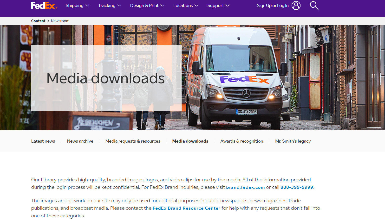
The color system carries its own logic. "Fed" stays a fixed corporate purple (#4D148C) as an anchor across every division, while "Ex" changes color by service line, orange for Express, with green, red, and blue used at points for Ground, Freight, and other divisions before FedEx simplified back to a consistent orange-purple pairing in 2016. That's a real example of a brand solving a multi-division consistency problem with color-coding instead of separate logos entirely.
Operational insight: a locked master-brand element paired with a controlled variable, like FedEx's division colors, maps cleanly to DAM permissions. Lock the wordmark and typography as non-negotiable, then let color or a secondary tag vary by approved, pre-set options only, rather than leaving it open to interpretation.
3. Dropbox
Dropbox's brand guidelines live as an interactive microsite, built with design studio Daybreak, and it's a useful example of a guide that treats explanation and demonstration as equally important. The site includes a Variable Type Explorer that lets a visitor manipulate Dropbox's custom typeface directly, and an "Icon Slot Machine" that remixes the brand's icon system live in the browser, rather than just describing the rules in text.
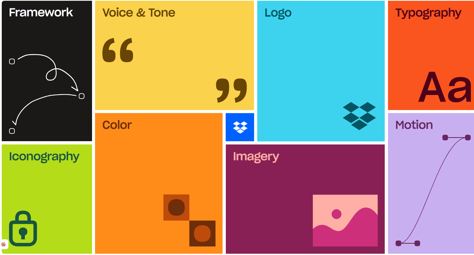
The voice and tone section is notably concrete for a guide this size, instructing writers to trim words, use strong nouns, write the way you talk, and avoid jargon, paired with a stated design strategy built on four words, humanity, clarity, action, and delight. Dropbox's separate developer branding guide is stricter and more legal in tone by comparison, spelling out exactly how a third-party app can reference the Dropbox name, for example on a "Save to Dropbox" button, without implying a partnership that doesn't exist.
Operational insight: product screenshots go stale fast, so a guide built around an interactive, always-current demonstration rather than static screenshots avoids the exact staleness problem a PDF creates. Connect current UI screenshots directly in the DAM so marketing pulls the live build instead of last quarter's interface.
4. Apple
Apple's brand rules split cleanly by the audience, and that split is itself the operational lesson. Its Channel Affiliate Identity Guidelines require resellers to use only current, Apple-provided graphics, explicitly banning outdated assets like the old "glass" logo or the Garamond-based wordmark Apple retired more than 15 years ago, on the reasoning that stale graphics make Apple itself look outdated by association. When an Apple "channel signature" appears in a partner's advertisement, the guide requires it to be smaller than the reseller's own identity and placed in a secondary position, never substituted for the partner's own branding.
Apple's Affiliate Program guidelines run even stricter for pure marketing partners, since Apple doesn't allow its logos or product images to be used in a way that could suggest Apple endorses a third party's product or promotion at all.
Operational insight: this is a strong model for channel partner enablement at scale. Partners get one approved, current image set, distributed with expiration built in, so an old graphic simply can't remain in circulation once Apple issues a refresh.
5. Starbucks
Starbucks documents its own brand assets with unusual precision for a retail chain. Siren Green is specified at Pantone 3425 C and HEX #00704A, and the company's own creative expression guide describes it as the brand's single most identifiable asset, present on everything from aprons to app icons. What makes the system worth studying operationally is how it flexes without losing that anchor. Starbucks runs an expanded family of greens, a near-black forest green for immersive digital surfaces, a brighter "House Green" for the Rewards program, and shifts its supporting palette seasonally, spring pastels giving way to red holiday cups, while the guide is explicit that brand green must always have a presence, either in the composition or through the Siren logo itself, no matter what season it is.
The logo system carries its own strict background-contrast rules, specifying which of four logo variants, full-color, full-color reverse, one-color black, one-color reverse, to use based on the exact gray-scale value of the background behind it, a level of precision built for a brand that has to look right on everything from a paper cup to store signage across more than 30,000 locations.
Operational insight: campaign asset kits work well inside a DAM for exactly this pattern. Bundle the approved seasonal photography, templates, and the locked core palette for a launch, then share them with regional or franchise teams through a controlled link, so local activation stays on-brand without every store needing to interpret the seasonal shift itself.
What a Modern Style Guide Must Include
A useful style guide needs four core pieces, logo and color, typography and voice, imagery, and motion and accessibility, since these are the questions your team asks every week.
A weak guide shows one logo. A strong one documents primary and secondary marks with clear-space rules, minimum sizes, and misuse examples. Color needs the same rigor. List exact values for core colors, from HEX for web to Pantone for print, and add accessibility contrast guidance and dark mode variants where your digital teams need them.
Core style guide components and how each one connects to asset governance inside a DAM.
Mobile readability affects every channel, so many guides set body-size minimums and web-safe fallbacks, with type hierarchy staying clear from headline to caption. Voice and tone need concrete examples too, showing how the brand speaks on a support page compared with a launch post or product page. Imagery rules should cover composition, treatments, and approved sources, which helps e-commerce and content teams choose images that match the brand on the first pass.
Digital products move, so motion standards define animation styles and micro-interactions in a way a static PDF can't keep up with. Accessibility deserves its own section too, documenting contrast expectations, alt text guidance, and font sizing so assets stay usable across channels. AI content protocols round out a modern guide, setting when AI drafts are acceptable, what requires human review, and how brand voice applies to generated copy.
How to Turn a Static Style Guide Into a Governed System
Turning a static style guide into a governed system takes three moves: audit and align, structure and codify, then embed and monitor, since version sprawl usually starts before a guide ever reaches a portal.
- Audit and align: Pull every version of your guidelines, and gather the assets scattered across marketing, creative, and e-commerce teams. That inventory usually reveals duplicate logos, conflicting color values, and old campaign files still circulating, plus who can change what today.
- Structure and codify: Draft a table of contents that mirrors real work, then map each section to the assets it governs. Codify each rule with metadata (if a logo is approved for light backgrounds only, tag it with that requirement, file type, and approval owner). Separate multi-brand workspaces let each sub-brand keep its own palette and font library under one governance model.
- Embed and monitor: Host the guide where people already work, connected to templates, approvals, and search, since people follow rules faster when the rules show up where the work happens. Give each audience its own view, so internal teams and franchisees see only what's approved for them, and track view and download patterns to see where confusion keeps showing up.
Platform choice decides whether those rules stay current, searchable, and visible to the right people, since a polished guide can still fall short in daily use. A good platform updates rules in place, supports separate guidelines per brand or region, and gives franchisees and agencies a curated, permissioned view through secure links, with AI tagging and visual-similarity search cutting down on folder-hunting.
A few hidden costs are worth planning for before you commit:
Common hidden costs when hosting brand guidelines, plus the question that flags each one.
A Quick Brand Ops Glossary
Buying conversations fill up with shorthand fast, so these definitions keep discussions clear across brand, creative, and ops teams.
- Brand style guide: A document that governs the visual and verbal expression of a brand, covering logos, color, typography, voice, imagery, and usage rules.
- Content style guide: The editorial layer that covers tone, grammar, formatting, and terminology, often built on standards like the AP Stylebook.
- Brand portal: A web-based space where internal teams and partners access approved brand assets and guidelines.
- DAM: A Digital Asset Management platform that stores, organizes, and distributes files with metadata, permissions, and workflows.
- Brand ops: The practice of managing how brand assets and guidelines run across teams and markets.
- Marketing ops: The function that manages marketing systems, processes, and handoffs that support campaigns and content production.
- Creative operations: The function that manages creative intake, resourcing, approvals, and delivery across channels.
How BrandLife Turns Style Guides Into Living Systems
A guideline becomes useful when the rule sits next to the file people need, and BrandLife was built around that idea. With interactive brand guidelines, a designer opening a logo sees the approved palette, usage guidance, and current version in one place. The BrandLife demo video shows exactly this workflow, including how guidelines and assets sit in the same searchable collection instead of a separate file.
- AI tagging and visual search cut file-hunting time, with customers reporting 40% less time searching, 50% faster launch cycles, 70% fewer asset-request emails, and 6+ hours saved weekly per creative.
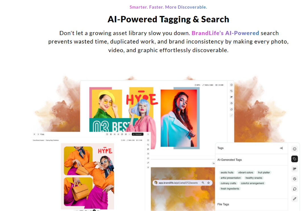
- Multi-brand workspaces give each sub-brand its own palette, font library, and storage under one governance model.
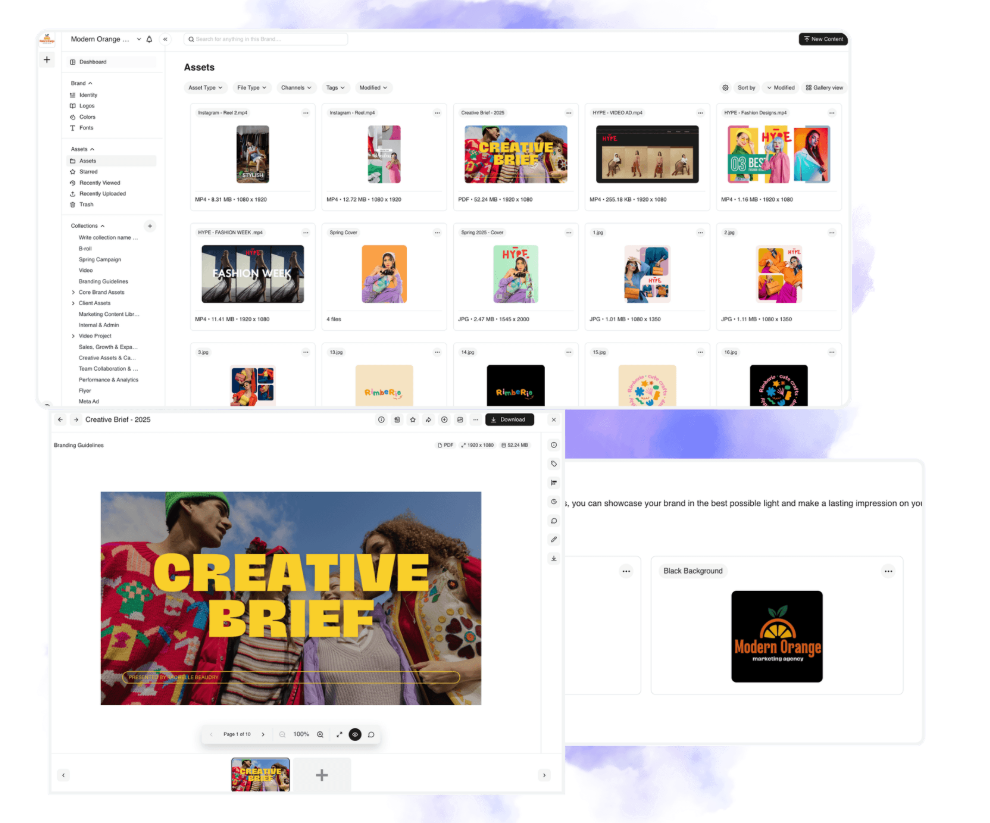
- Unlimited free partner portals give franchisees and agencies access to only their approved assets, through secure, expiring links.
- Version control, approval workflows, and asset expiration retire outdated files before they spread.
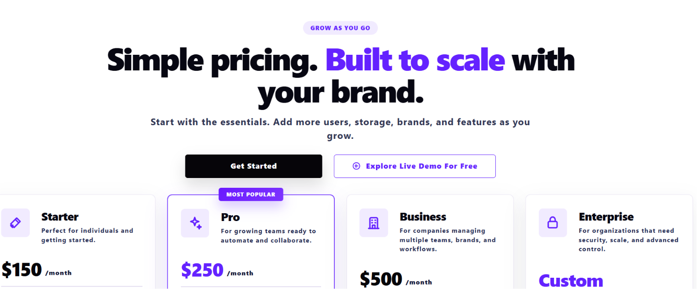
Pricing stays transparent. Starter is $150/month for one user, one brand, and 1GB of storage, with core DAM features, AI tagging, brand guidelines, and integrations with Google Drive, Dropbox, OneDrive, SharePoint, Canva, Figma, and Slack. Enterprise is custom-priced, with add-ons like Visual Search, Asset Watermarking, SSO, and Custom Roles & Permissions available as you scale.
Get Started with BrandLife and see how BrandLife centralizes brand assets, guidelines, and approvals for your team.
Frequently Asked Questions
How long is a typical brand style guide?
Length follows brand complexity more than a fixed page count. A smaller brand may keep the guide lean, while a global portfolio may need much more detail, and coverage matters more than length.
Who should own the brand style guide?
Ownership usually sits with a Head of Brand or Brand Manager, with support from design ops on the asset side. One accountable owner keeps the guide current and settles rule questions quickly.
How often should I update brand guidelines?
Set a regular review cadence, then update sooner when the brand changes. A rebrand, a new channel launch, or a product shift usually calls for immediate edits, and living guidelines make this easier.
What's the difference between a brand style guide and a content style guide?
A brand style guide covers the broader expression of the brand, including visuals and voice. A content style guide focuses on writing, tone, grammar, formatting, and terminology, often nested inside the broader guide. (34 words)
Can I move my existing PDF guidelines into a DAM without rebuilding everything?
Yes. Most teams upload current assets, then map existing rules into structured pages one section at a time, centered on metadata cleanup. Ask any vendor whether migration support is included.